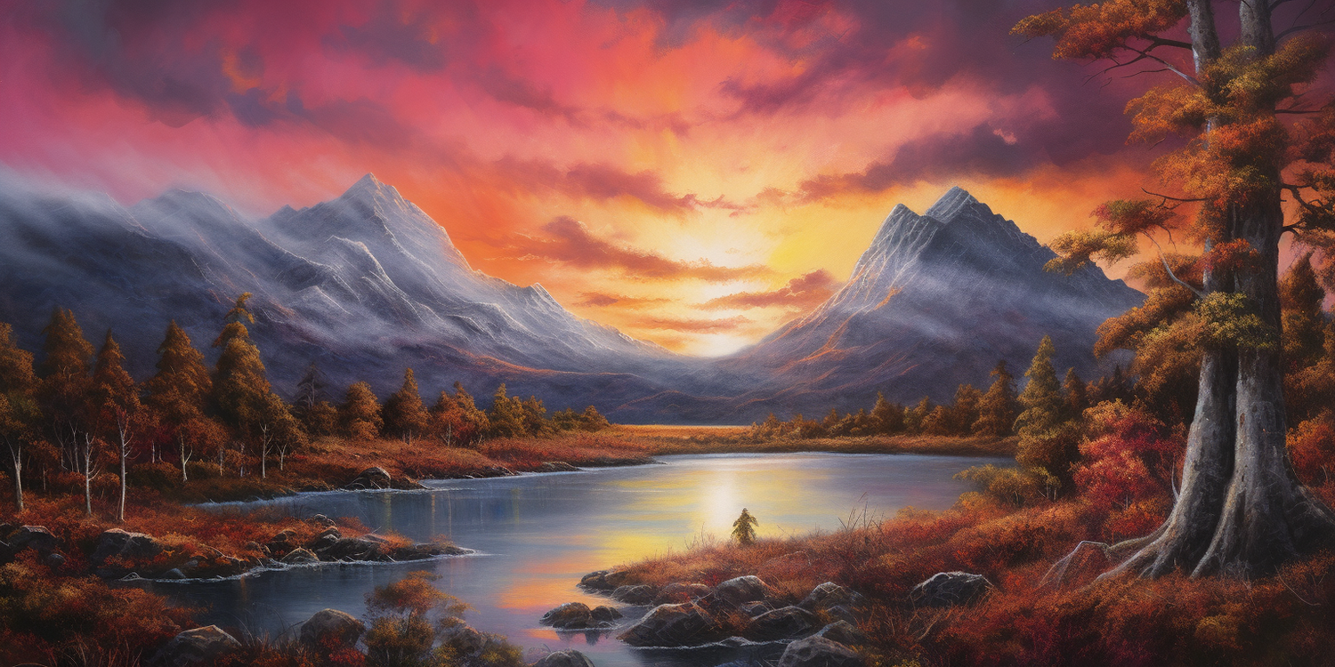
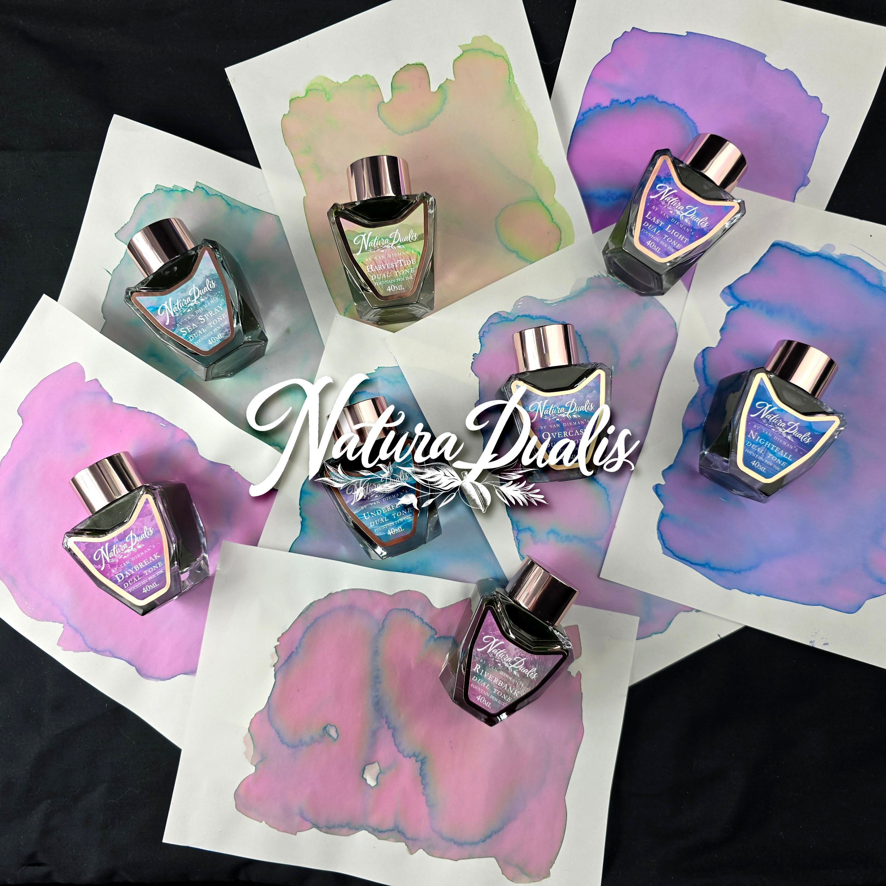
The Natura Dualis collection by Van Dieman’s is an exploration of contrast and harmony within the natural world — where opposites don’t collide but coexist. Each ink is designed to embody a moment of duality: night meeting day, earth meeting sky, water meeting land, motion meeting stillness. But this is more than a thematic idea — it's built into the ink itself.
Every colour in the Natura Dualis series is formulated for dual or multi-shading performance. These inks are crafted to produce highlighted edges, riverlets of secondary tone, subtle halos, and even colour splits — revealing hidden depths as they dry, depending on the nib, paper, and flow. The result is writing that feels alive, and ink that tells more than one story.
-
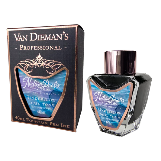
Van Dieman's - Natura Dualis Underflow Dual Tone Fountain Pen Ink
Vendor:Van Dieman's InkRegular price $25.95 AUDRegular priceUnit price per$25.95 AUDSale price $25.95 AUD -
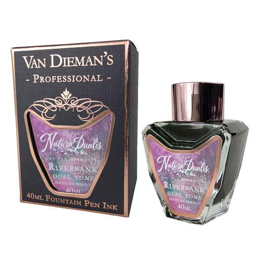
Van Dieman's - Natura Dualis Riverbank Dual Tone Fountain Pen Ink
Vendor:Van Dieman's InkRegular price $25.95 AUDRegular priceUnit price per$25.95 AUDSale price $25.95 AUDSold out -
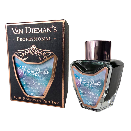
Van Dieman's - Natura Dualis Sea Spray Dual Tone Fountain Pen Ink
Vendor:Van Dieman's InkRegular price $25.95 AUDRegular priceUnit price per$25.95 AUDSale price $25.95 AUDSold out -
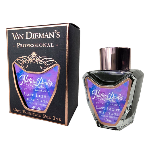
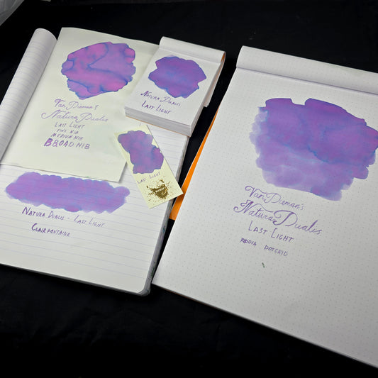
Van Dieman's - Natura Dualis Last Light Dual Tone Fountain Pen Ink
Vendor:Van Dieman's InkRegular price $25.95 AUDRegular priceUnit price per$25.95 AUDSale price $25.95 AUDSold out -
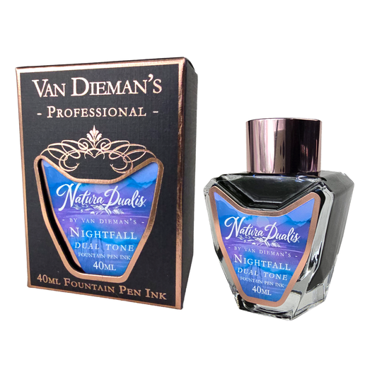
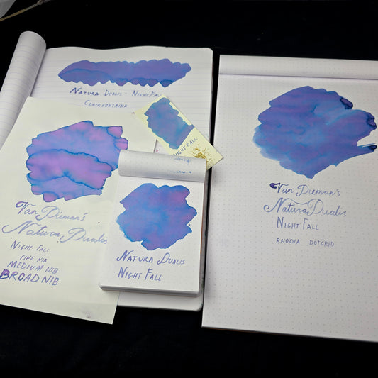
Van Dieman's - Natura Dualis NightFall Dual Tone Fountain Pen Ink
Vendor:Van Dieman's InkRegular price $25.95 AUDRegular priceUnit price per$25.95 AUDSale price $25.95 AUD -
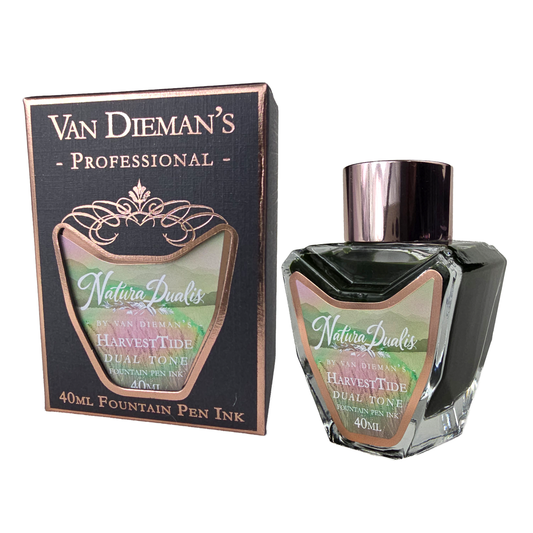
Van Dieman's - Natura Dualis HarvestTide Dual Tone Fountain Pen Ink
Vendor:Van Dieman's InkRegular price $25.95 AUDRegular priceUnit price per$25.95 AUDSale price $25.95 AUDSold out -
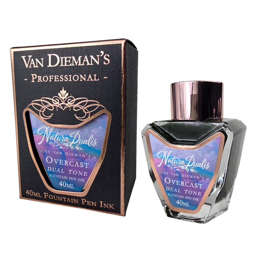
Van Dieman's - Natura Dualis Overcast Dual Tone Fountain Pen Ink
Vendor:Van Dieman's InkRegular price $25.95 AUDRegular priceUnit price per$25.95 AUDSale price $25.95 AUDSold out -
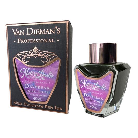
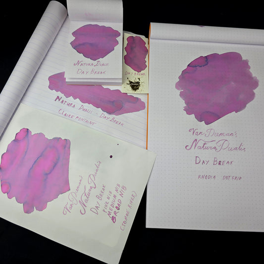
Van Dieman's - Natura Dualis Daybreak Dual Tone Fountain Pen Ink
Vendor:Van Dieman's InkRegular price $25.95 AUDRegular priceUnit price per$25.95 AUDSale price $25.95 AUD
-
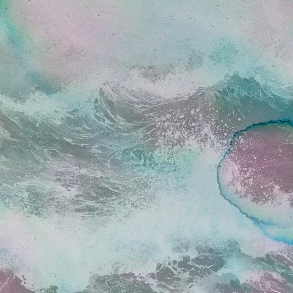
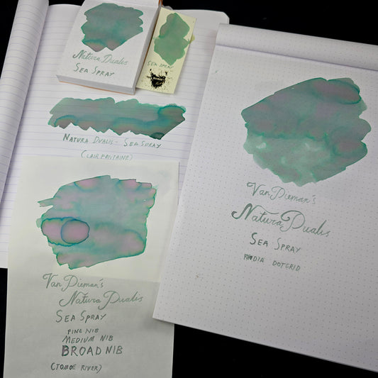
Sea Spray is the gentlest in the collection, and perhaps the most elusive. It evokes the fine mist at the edge of the ocean — not the wave, but what the wave leaves behind. It’s a breath of salt and wind, where pale light hits drifting water and vanishes again.
This ink carries a delicate seafoam green base, split by blooming lavender-pink hues and edged with cool marine blue. In broader swatches, it reveals luminous haloing and soft internal textures — like sunlight refracting through mist. On Tomoe River and Clairefontaine, expect soft rivers of colour that shift tone mid-stroke; in writing, it remains legible but uniquely atmospheric.
Sea Spray is for the dreamers — an ink as airy as it is expressive, capturing the meeting of sea and sky in a shimmerless, multi-tonal wash.
-
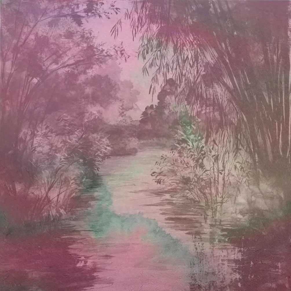
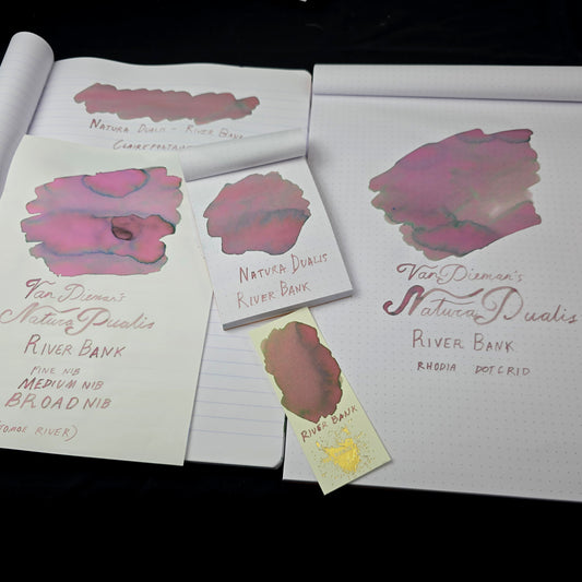
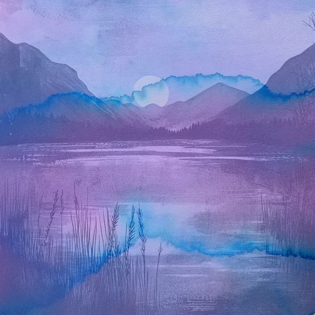
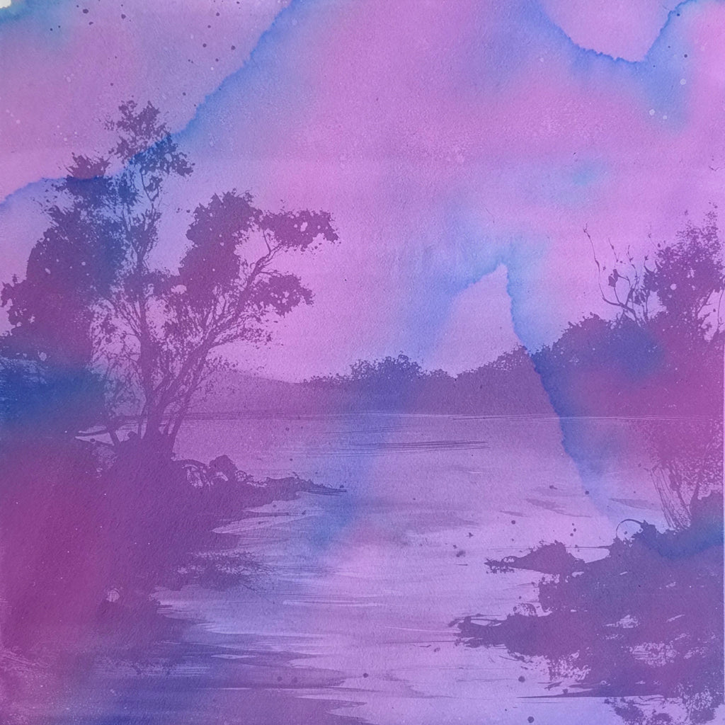
River Bank captures the earthy stillness and slow-life shimmer of the land where water meets soil. This is not the torrent or the flood—it’s the patient, rooted place where reeds grow and frogs call. It evokes that natural margin between movement and grounding, where silt meets stone, reflections ripple with wind, and the river moves ever on, while land sits serenely ever still.
The ink itself reflects this rich balance. A ruddy umber base gives way to swirls of aquatic blue, earthy pink and mossy green and flashes of muted violet, depending on paper and pen. It separates with complexity, creating stunning chromatographic spreads and organic texture. Whether laid down wet and heavy or drawn out fine and light, River Bank reveals something new every time.
-
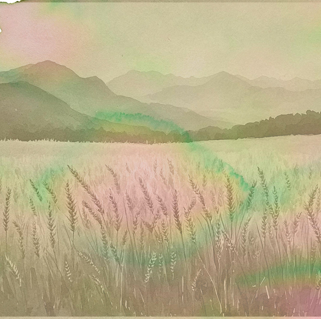
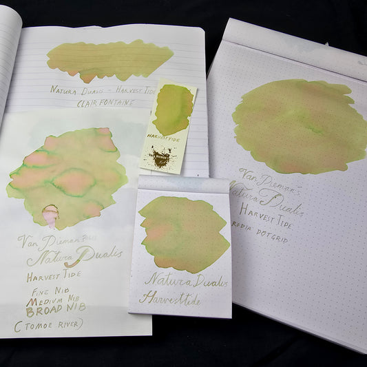
HarvestTide brings this vision down to earth. It captures the precise moment where summer begins to tip into autumn — when the wheat is tall and gold, but the light has softened and the air carries the first cool current of change. If Daybreak and Nightfall are skybound, HarvestTide is rooted in the land — in grain, soil, and seasons turning.
The colour is soft but richly complex. A mellow golden base gives way to cool green halos and hints of rosy warmth in areas of ink pooling. The shading is subtle but unmistakable — layers of warmth and coolness, ripeness and rest, all in one. On Tomoe River and other high-performing papers, expect dramatic multi-tonal flow; in regular writing, a warm, organic variation that settles into something timeless.
-
Nightfall is the moment where light gives way to shadow, but doesn’t vanish — it lingers, deepens, and cools. This ink captures that quiet shift in the sky, when the last warmth of day recedes and the night begins its slow approach. Where Daybreak glows with optimism, Nightfall hums with calm, introspection, and softness.
The colour begins as a dusky violet, but shades outward into stormy indigo, lavender, and a subtle cool blue fringe. On paper, it pools richly in broad strokes, showing strong edge shading and layered tone, while in finer lines it leans toward a faded twilight lilac. Like its namesake, it’s a colour of quiet complexity — one that doesn’t demand attention, but rewards it.


-
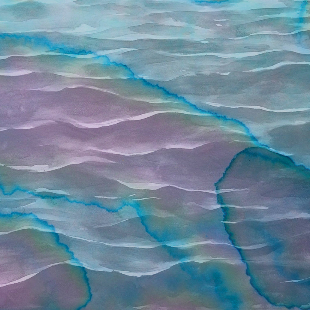
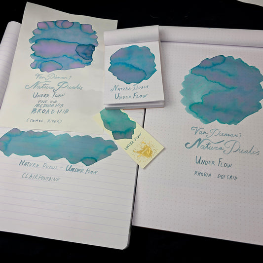
Underflow is inspired by hidden strength — that quiet, unseen current just below the surface. Where Sea Spray glides and Riverbank roots, Underflow moves — slow, deliberate, and steady. It represents the pull of the tide, the motion you feel before you see it. This ink doesn’t shout; it draws you in.
On paper, it flows in a cool sea-glass blue, fading into mauve-violet underlayers and rimmed with teal-toned halos where it pools. Its duality is striking — equal parts aquatic and atmospheric. In finer nibs, it appears clean and modern. With broader nibs and shading paper, it unfurls into a beautifully separated spectrum of oceanic tones, with a distinct sense of motion even in still lines.
Underflow is contemplative, modern, and deceptively complex — for those drawn to depth rather than drama.
-
Daybreak is the first light, full of motion and promise. If Nightfall is the hush before dreams, Daybreak is the breath before the world awakens. It captures that liminal sky when violet shadows are still present, but the pink warmth of a new day has already begun to spill forward. It’s a moment of clarity, but also of softness — nothing yet fixed, everything in flux.
On the page, Daybreak opens in a vivid rose-pink base that blooms with lavender shading and cool indigo rivering at the edges. It behaves like morning mist catching sunlight — one moment delicate, the next rich with hue. With broader nibs and high-shading papers like Tomoe River, the ink reveals dramatic tonal separation, while finer lines offer a calm, cheerful brightness. It’s a colour of renewal — confident, expressive, and full of light.
-
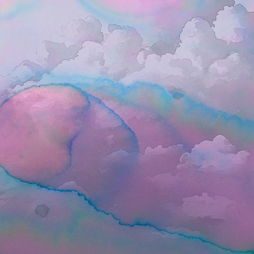
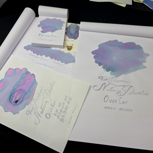
Overcast represents the subdued majesty of a sky blanketed in cloud. It captures that moment when the light dulls and colours flatten, yet somehow, from that soft desaturation, a subtle beauty emerges. There is still vibrancy under the grey — hints of blue, lilac, and green flicker through like light trying to break through.
This ink perfectly reflects the collection’s dual nature. On most papers, it settles into a misty lavender-grey base, with shifting overlays of teal and rose, sometimes separating into dusty halos or marbled pools of colour. In broad nibs or wet applications, blue/green rivers emerge, like clear sky appearing hopefully through the cloud cover. It’s a colour that feels gentle, quiet, but not without life — a tranquil ink for calm pages and thoughtful writing.
Let Overcast transform your writing with the quiet power of a brooding sky.
-
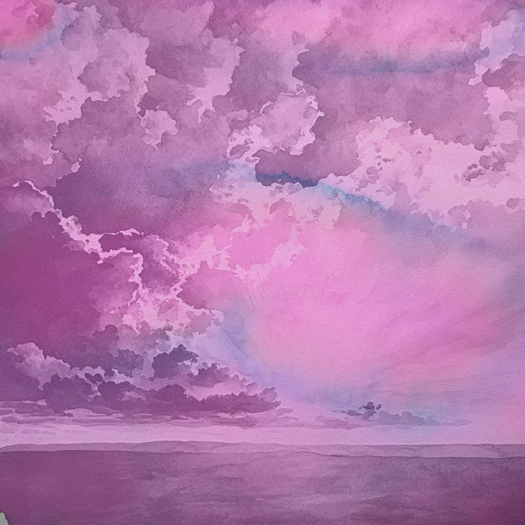
Last Light is that final trace of the sun before it vanishes — not quite day, not quite night. It doesn’t blaze, it lingers. It hums rather than sings. In the Natura Dualis collection, it is the counterpart to Daybreak: where Daybreak announces its arrival, Last Light quietly withdraws.
The colour is deeply expressive — a rich, dusky violet base illuminated by soft pinks and fading into cool blue halos at the edges. In broader strokes, it moves like twilight on the page, with large blooms of colour separation and shadow. In finer writing, it leans to a gentle mauve, perfect for moody journaling, introspective letters, or quiet poetry.
It’s not the brightest colour in the set — but it might be the most reflective.


